Language Atlas
Interactive data exploration of the world’s 50 most spoken languages
- Data science
- Data visualisation
- Personal project
Language Atlas is a personal data science project. I assembled a structured dataset of the 50 most spoken languages in the world, and designed an interactive atlas that lets anyone explore it: who speaks what, where, in which script, and how many speakers learned it as a second language.
Role: data curation, analysis, data visualisation and interface design.
The question
Rankings of the world’s languages are everywhere, but they are usually a static list or a single chart. They answer “which language has the most speakers?” and stop there. The more interesting questions sit between the numbers: which languages grew mostly because people learn them as a second language, which families dominate, which scripts are shared by very different languages?
I wanted to build something where a curious person could ask those questions without writing a query, and where the data would stay honest about what it can and cannot say.
The data
I structured a dataset of 50 languages, one record each, combining figures from public references such as Ethnologue, UNESCO and SIL International. Every record carries the same fields, which is what makes filtering, comparison and charting possible without special cases:
- Name, native name and ISO 639-1 code.
- Total, native (L1) and second-language (L2) speakers, from which the native ratio is derived.
- Language family, writing system and region.
- Countries where it is spoken, UNESCO vitality status and a short fact.
Speaker counts are estimates and sources disagree, so the atlas states this in the interface and treats it as an educational tool rather than an authority.
Exploring
The explore view is the heart of the atlas. A single search box matches language names and countries, three filters narrow by family, script and region, and the results can be sorted by total, native or second-language speakers, alphabetically or by family. Results can be seen as cards or as a dense table, and the choice is remembered between visits.
Each card shows the one number that matters most, a bar that splits native from second-language speakers, and a colour coded by family so patterns emerge as you scroll. Selecting a card opens a detail panel with the full record, which keeps the list scannable while the depth is one click away.
Visualising
The charts were chosen to answer specific questions rather than to decorate the page.
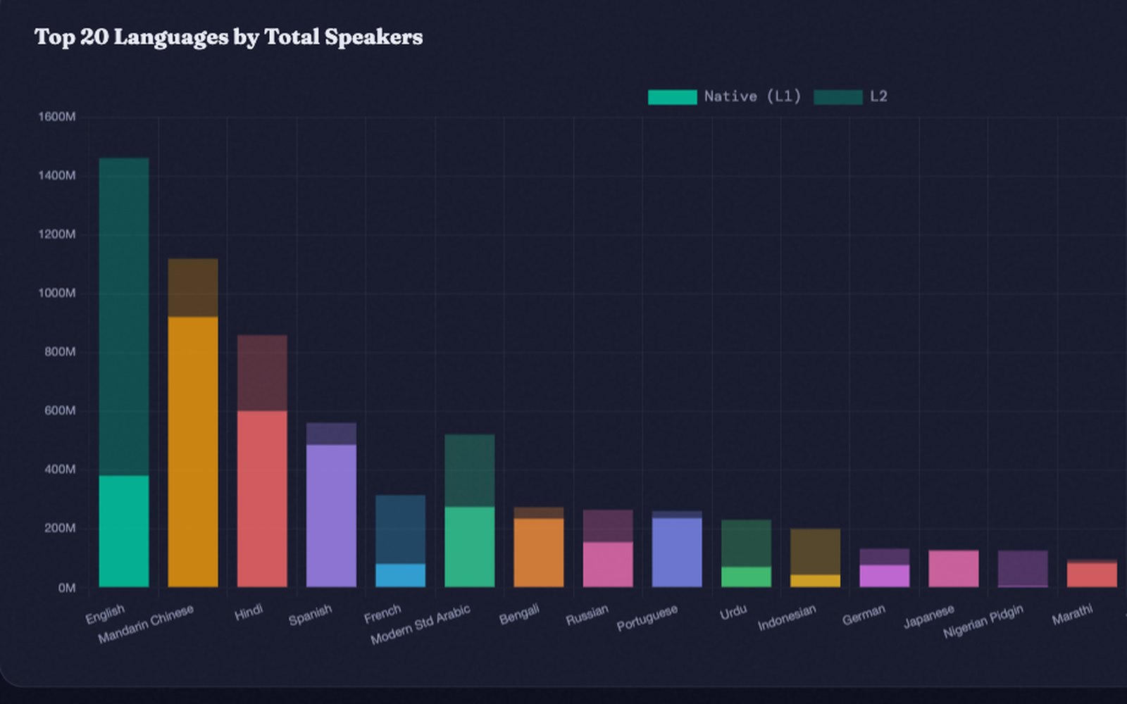
- A bar chart of the top 20 languages, with native and second-language speakers stacked, shows scale and how much of it is learned rather than inherited.
- A doughnut of native versus second-language speakers gives the global picture at a glance.
- A second doughnut shows how the 50 languages are distributed across families.
- A 100% stacked chart of the top 30 languages compares the ratio, which is where the surprises are.
Family colours are used consistently across cards, charts and the detail panel, so a colour always means the same thing.
Comparing
Numbers become meaningful when set side by side. The comparison tool lets you choose up to three languages and see their figures in parallel, with a radar chart that normalises total speakers, native speakers, second-language speakers, number of countries and second-language ratio on a common scale. The shapes make the difference between a language that is spoken at home by many and one that is learned around the world immediately visible.
Responsive and accessible
The atlas is designed mobile first in spirit: a sticky navigation tracks the current section, filters wrap into a compact grid, cards become a single column and charts resize to their container. Controls are labelled for assistive technology, the detail panel behaves as a dialog, and the dark theme keeps text at comfortable contrast.
Reflection
Language Atlas is small, but it shows how I approach data work: start from the questions a person would actually ask, structure the data so that every answer is cheap to compute, and then design the interface so the answers are visible rather than buried. It also taught me to be explicit about uncertainty, because a beautiful chart can imply a precision the data does not have.