WelcoKit
An AI-native guest experience platform
- SaaS product
- UX/UI design
- End to end
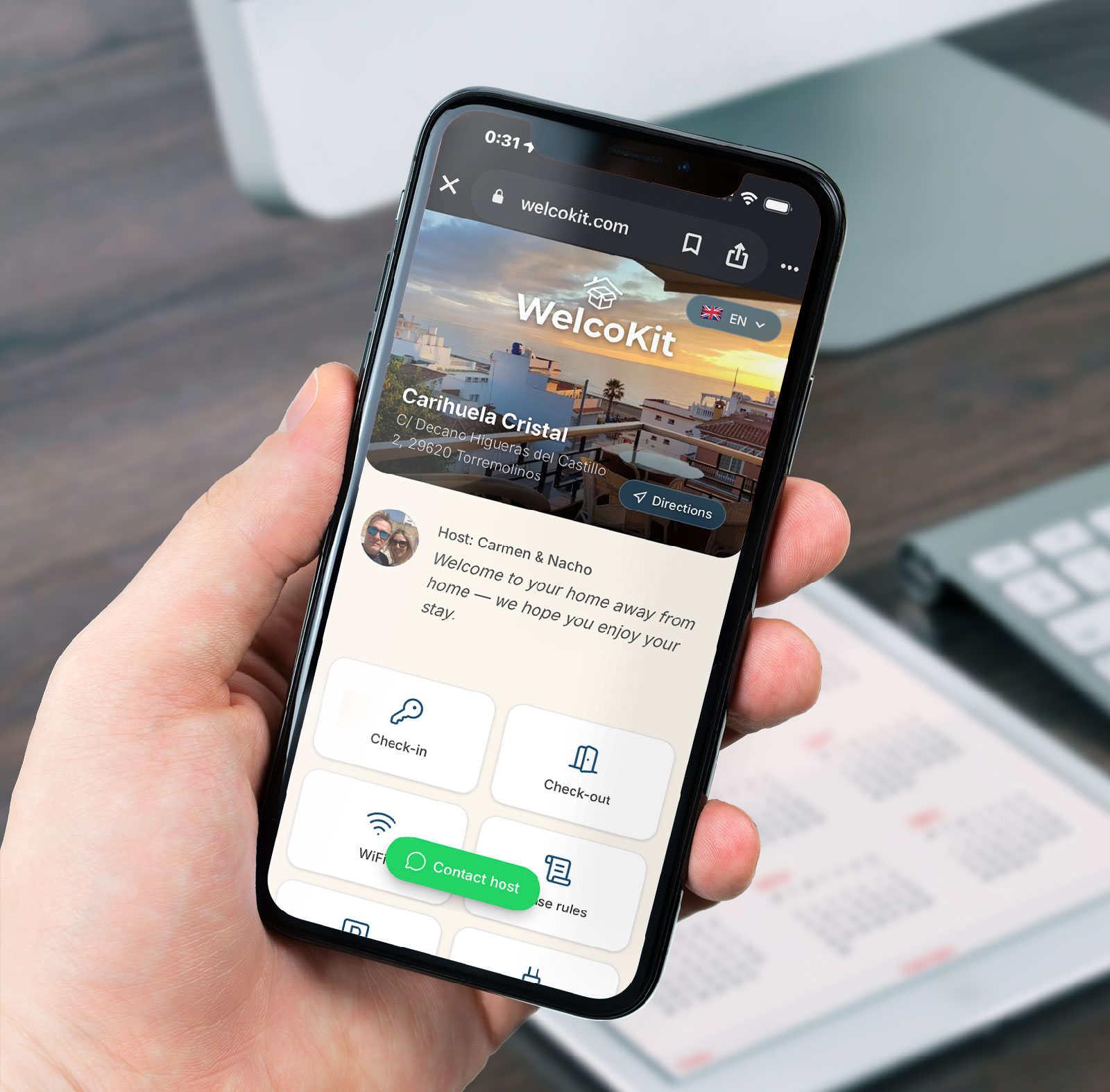
WelcoKit is a digital guest-guide platform for short-term rental hosts. It replaces scattered check-in instructions and repetitive WhatsApp questions with one personalised link per guest, and it was designed, built and shipped end to end.
The problem
Hosts answer the same questions for every guest: the wifi password, how to get in, where to park, the house rules and what to do nearby. That information usually lives in a printed folder, a PDF nobody opens or a string of rushed WhatsApp messages sent as the guest arrives.
As a co-owner of two short-term rentals myself (Sol Muralla in Seville and Carihuela Cristal in Torremolinos), this was not a hypothetical brief but a problem I lived with. It had two costs:
- Time: the same five or six questions, repeated for every stay and every property.
- Guest experience: arrival is the first impression of a stay, and a slow or incomplete answer undermines it from the start.
Strategy
The core decision was to design around a single, disposable link instead of a login or an app. A host generates one URL per stay, tied to the guest’s name and dates. There is no account to create and no app to download: the guest opens a page that already knows who they are and when they are staying. Three choices followed:
- Zero friction for the guest: one tap from a WhatsApp or Airbnb message, with no onboarding.
- Minutes, not hours, for the host: setup feels closer to filling in a form than building a website.
- AI as leverage, not a gimmick: the local recommendations, the most tedious section to write, are generated from the property’s location and destination type, and the host can edit anything.
A free tier for a single property was a deliberate go-to-market choice, so hosts can try the product on one listing before paying for more.
User journeys
To understand both audiences end to end, I mapped two journeys. The host journey runs through discovery, evaluation, onboarding, the first guest, ongoing use and upgrade. The guest journey runs from pre-arrival and opening the guide to arrival and check-in, the stay, asking for help and check-out. Each map covers actions, touchpoints, feelings, pain points and opportunities.
Two frictions repeat across both maps: trust in the AI-generated recommendations, and uncertainty about whether the guest actually opens the link. The opportunities that came out of them shaped the product: a live guide preview before sign-up, effortless editing of the AI output, a clear confirmation that the guide was opened, and an upgrade prompt that shows what the host has already saved.
Design process
Two user roles needed two different interfaces, because they are used in different contexts. The host dashboard is a utilitarian admin tool used at a desk, optimised for fast data entry. The guest guide is a calm, editorial reading experience used on a phone, often on the way to the apartment, and it had to load fast, work one-handed and feel closer to a boutique hotel’s welcome page than to software.
The information architecture is built around content blocks (wifi, check-in, check-out, house rules, parking, appliances, recommendations and custom notes). Each has its own icon so guests can scan the guide visually, closer to airport signage than a document.
The visual identity pairs slate blue (#1B4F72) and a vibrant orange (#FF4200) with a serif display face for property names and Inter for everything functional, avoiding the generic SaaS dashboard look because the guide doubles as part of the host’s hospitality brand. The product is multilingual by design, with Spanish, English, French, Italian and Portuguese supported from early on.
From design to production
I took the product from the first sketch to a live service myself, without a separate development team in between, so every design decision reached production intact.
- Design first, in detail: screens, states and copy were worked out before the build, so every iteration had a concrete spec to follow.
- Built in short cycles: the interface and the data model were developed and refined iteratively instead of through one large handoff.
- Iterative growth after launch: from two to five languages, from generic links to personalised expiring guest links, destination-type classification for better recommendations, a monthly AI-regeneration quota per category and Stripe subscription guards.
- Validated on real properties: Sol Muralla and Carihuela Cristal were the first live tests, so early friction was caught first-hand.
Key features
The host side covers publishing, a cover image, the guest contact phone, a printable QR code and a simple analytics view. The guest side is the one-tap guide.
- Personalised, expiring guest links tied to a guest’s name and stay dates.
- AI-generated, location-aware local recommendations (what to see, where to eat, nightlife, beaches, nature), editable by the host.
- Content blocks with icons for wifi, check-in and check-out, house rules, parking and appliances, plus custom notes.
- Five languages for the interface and the generated content.
- Analytics for hosts: visits in the last 30 days, most viewed sections and visitor countries.
- A free plan for one property and paid plans managed through Stripe.
Outcome
WelcoKit is live at welcokit.com, running in production, and it serves as the guest guide for both of my own properties alongside its public free and paid plans. It is an active product, not a prototype: the expiring links and the destination-aware recommendations were added after launch, based on real use.
What this project shows:
- End-to-end ownership of a SaaS product, from problem definition through UX and visual design to production deployment.
- AI applied as a product feature: location-aware content generated for the end user.
- Design for two distinct audiences, an admin tool and a public guest experience, inside one coherent product.